Start with one sentence
Write the idea as one sentence before choosing images. If the sentence contains several unrelated messages, split it into separate visuals.

Visual storytelling is the practice of using images, structure and a small amount of text to help an audience understand a message, sequence or change. In business and education, it can turn an abstract or complicated idea into something people can discuss and remember.
A visual story is not simply a decorated slide. The visuals should explain relationships: where someone is now, what obstacle exists, what action happens and what outcome becomes possible.
Visual storytelling is useful when:
Most useful visual stories contain four elements:
The structure does not have to be linear, but the audience should know where to start and what conclusion to take away.
Write the idea as one sentence before choosing images. If the sentence contains several unrelated messages, split it into separate visuals.
Choose the people, objects, actions, emotions and outcomes that must be visible. Remove concepts that do not change the meaning.
Use a timeline for sequence, a journey for change, a map for relationships, a comparison for alternatives or a before-and-after layout for transformation.
Select illustrations that represent the concepts, not merely the topic. A useful visual shows what is happening, not just what industry the story belongs to.
Use text for names, decisions and takeaways that the image cannot express precisely. Avoid turning the visual back into a page of bullet points.
Show the visual to someone unfamiliar with the source material. Ask what they think is happening and what the main message is. Revise the structure if their interpretation differs from the intended one.
Hand-drawn visuals can make communication feel more human and approachable while keeping the message flexible. They are especially effective in workshops, facilitation and change communication, where the audience needs to participate rather than receive a polished advertisement.
The illustration style alone is not enough. Clarity still depends on choosing the right concepts and arranging them into a meaningful structure.
The following examples show how different kinds of information can be turned into clearer visual structures using Drawify.
Original idea: A customer moves through several disconnected support steps, waits for responses and may need to explain the same issue more than once before reaching a solution.
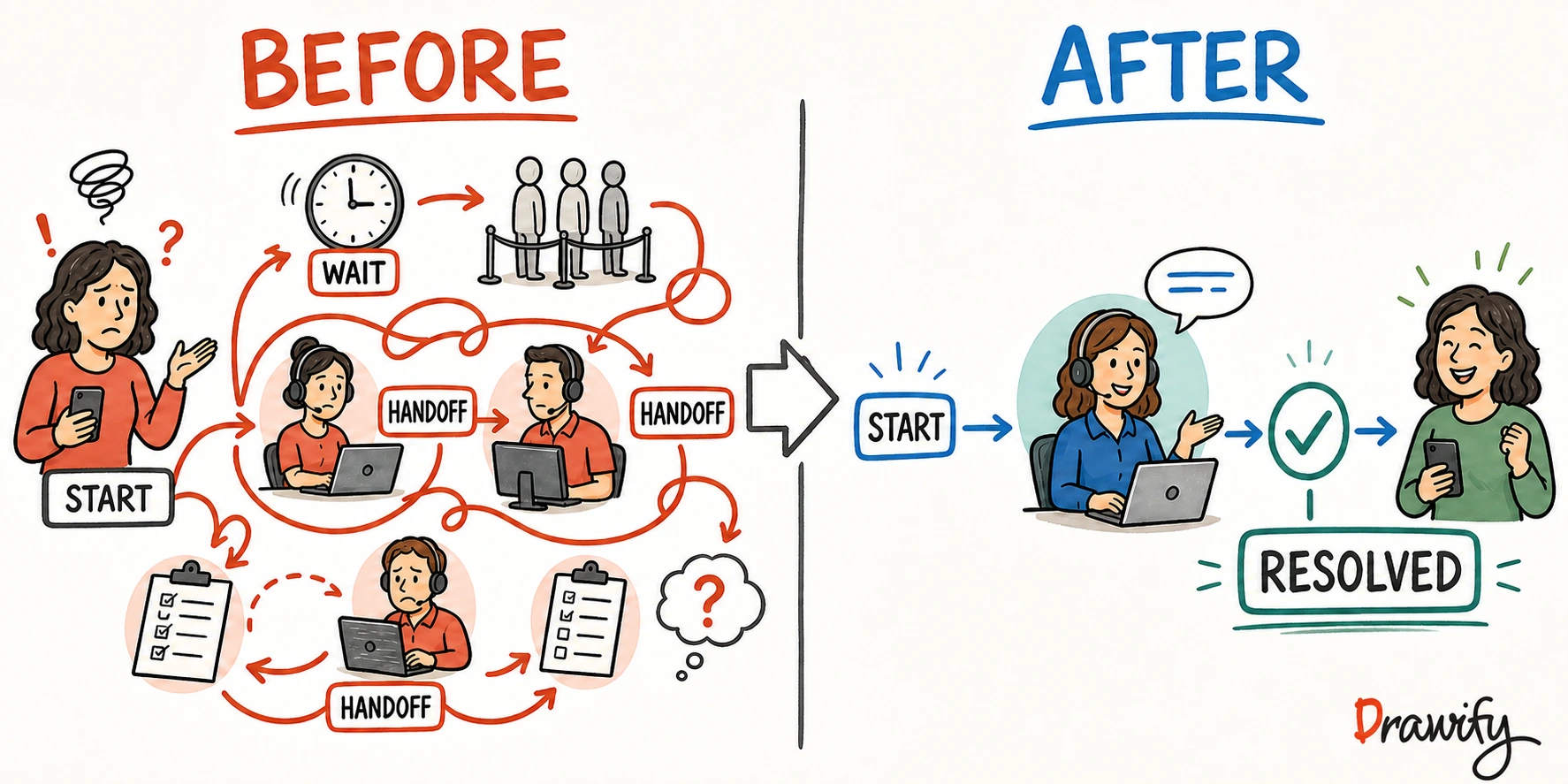
Design decisions: The visual uses a before-and-after structure so the audience can compare the current experience with the improved service flow without reading a long process description.
Original idea: A team is dealing with disconnected priorities, manual processes and unclear direction, and needs to understand the actions required to reach a more aligned future state.

Design decisions: The story is arranged from left to right to make the transition visible: current reality first, strategic actions in the middle and the future vision at the end.
Original idea: A workshop agenda needs to explain not only what happens during the session, but how participants move from listening and exploration to creating ideas, making decisions and agreeing on next actions.
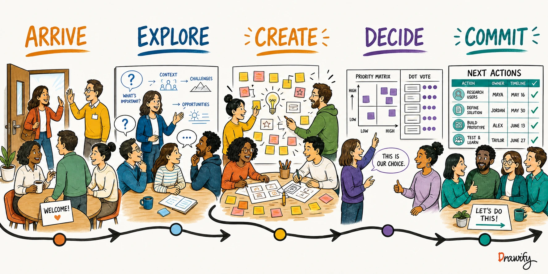
Design decisions: The agenda is shown as a journey rather than a simple schedule so the audience can see the progression of participation and the intended outcome of each stage.
Original idea: A process moves through several straightforward stages, but one approval step causes work to accumulate and slows progress toward the final outcome.
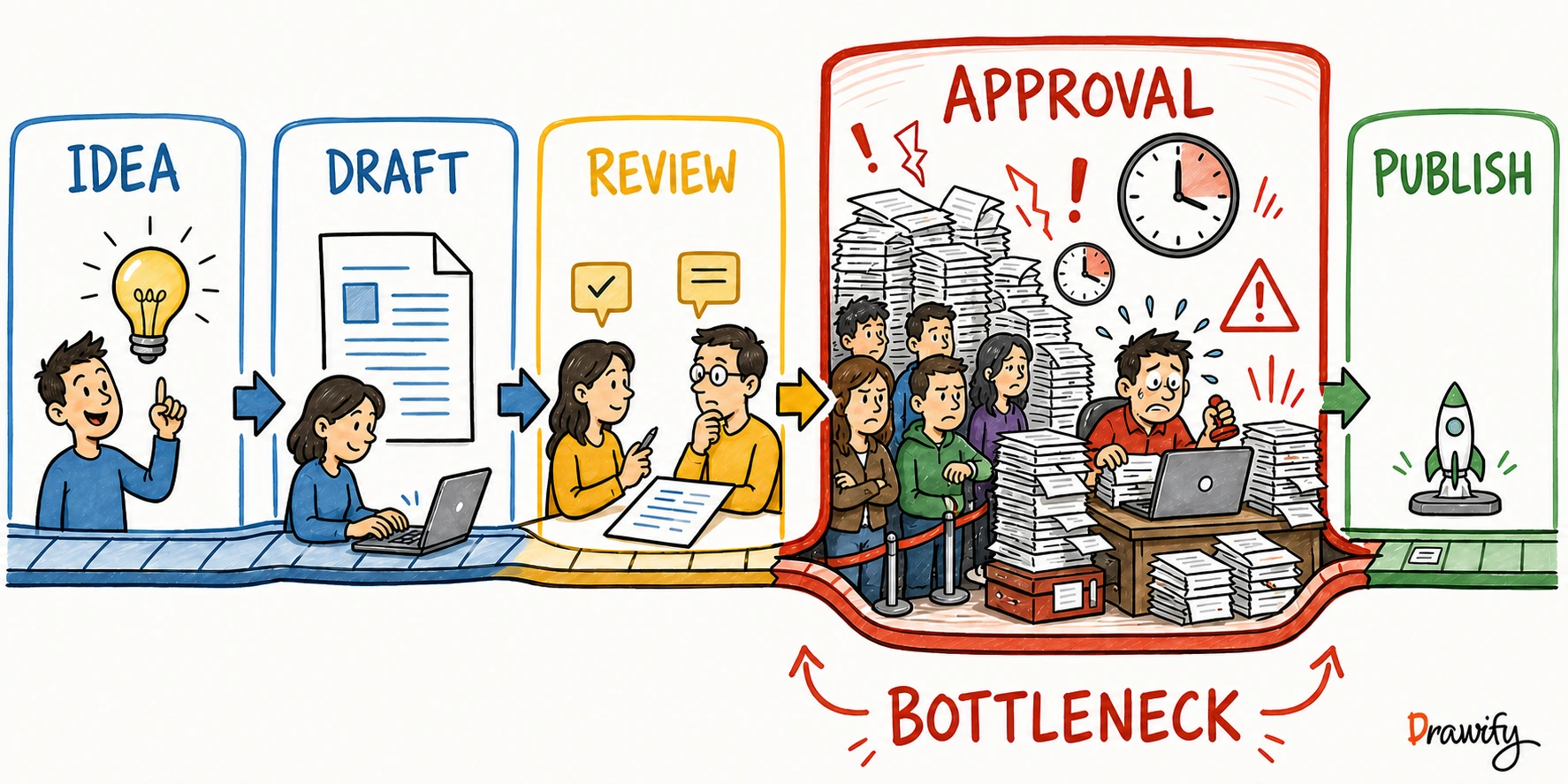
Design decisions: The process is shown as a simple sequence, while the bottleneck is given stronger visual emphasis so the viewer can identify the problem before reading every label.
Original idea: A feedback loop can be difficult to understand when it is described only in text because the process repeats rather than ending after one sequence of steps.
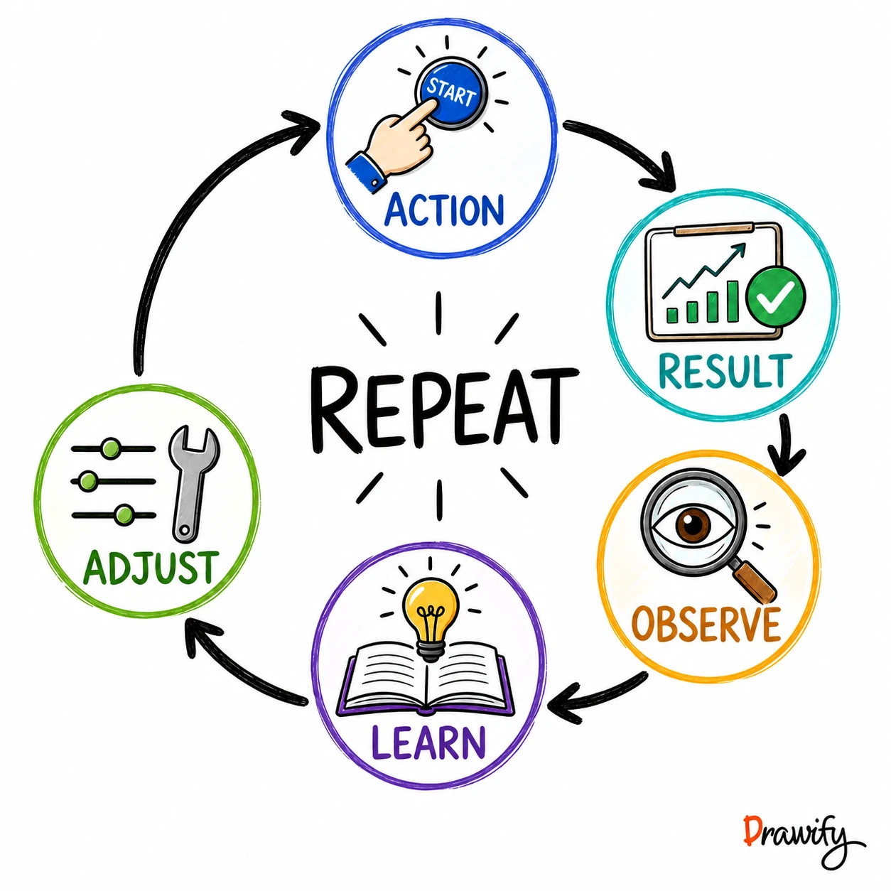
Design decisions: A circular structure is used instead of a straight line so the audience immediately sees that the process repeats and that each result influences the next action.
Drawify provides artist-created illustrations, practical templates and composition tools for turning ideas into visual stories. You can start from a template or individual visual elements, customize the layout and supported colors, and export the result for presentations, workshops, documents or supported integrations.
Maia can help suggest a starting visual structure from a written idea. The user then refines the message using Drawify's artist-created elements and editing controls.
No. The core skill is deciding what the audience needs to understand and choosing a structure that makes it visible. Templates and illustration libraries can help non-designers create an effective first version.
Data visualization represents quantitative information through charts or other visual encodings. Visual storytelling can include data, but it also uses illustrations, sequence, context and narrative structure to explain a broader message.
Yes. Common business uses include strategy, customer journeys, change communication, process improvement, workshops, sales conversations, training and stakeholder alignment.
Use only the text needed to remove ambiguity or state the takeaway. If the audience must read several paragraphs before understanding the visual, simplify the message or divide it into multiple visuals.
Start with one complicated message from a current presentation or document. Turn it into one sentence, choose a visual structure and build the first version with Drawify.
Subscribe to the Drawify Newsletter, and feed your creativity with visualisation tips and techniques, as well as the latest Drawify workshops, news and resources.